Category: Photography

Stronger Composition: Juxtaposition

Think about placing a sleek modern chair next to an intricately carved antique one in a photograph. The stark contrast between their styles and materials immediately grabs your attention and sparks curiosity. That’s the Rule of Juxtaposition at work – a compositional technique in photography that highlights the contrast between two opposing elements, whether in size, texture, color, or concept. This contrast not only draws attention but also creates a deeper narrative within the image.

The Rule of Juxtaposition leverages the human brain’s natural tendency to compare and make sense of differences. By carefully placing contrasting elements side by side, photographers can create visually compelling and thought-provoking images.
Why It Works

Visual Contrast:

Juxtaposition enhances the differences between objects, making them more noticeable. For instance, placing a vibrant red apple against a monochrome background makes the apple’s color more vivid. This visual tension draws the viewer’s eye and keeps their attention focused on the image.

Evolutionary and Psychological Perspective

Our brain’s sensitivity to contrast has roots in evolutionary biology. From a survival standpoint, the ability to detect differences—such as spotting a predator hiding in shadows or distinguishing ripe fruit from unripe—was critical. This innate ability to recognize contrasts continues to influence how we perceive and respond to visual stimuli today.

Psychologically, juxtaposition creates cognitive dissonance—a state where the brain must reconcile opposing elements. This dissonance stimulates curiosity and engages deeper thought, as the viewer tries to understand the relationship between the contrasting elements. Studies in neuroaesthetics suggest that images combining opposites activate regions of the brain associated with reward and novelty processing, enhancing the emotional and intellectual impact of the image.

Storytelling

Juxtaposition goes beyond aesthetics to convey meaning and emotion. A photograph of an old bicycle leaning against a shiny sports car, for example, contrasts nostalgia with modernity, creating a narrative about changing times. Such contrasts allow photographers to communicate complex ideas and evoke strong emotional responses in a single frame.


Cultural and Artistic Influences

Juxtaposition has been a powerful tool across centuries of art and photography:

  • Michelangelo’s “Creation of Adam” (Sistine Chapel Ceiling): The juxtaposition of divine and human forms, with God’s dynamic energy contrasted against Adam’s languid pose, emphasizes the connection and distinction between the two.
  • Pieter Bruegel the Elder’s “The Harvesters”: The contrast between laborers working the fields and villagers relaxing under a tree highlights the duality of toil and leisure in rural life.
  • Salvador Dalí’s “The Persistence of Memory”: The juxtaposition of melting clocks and a stark, barren landscape creates a surreal exploration of time and decay.

Modern photography continues to utilize juxtaposition to craft striking visuals. A photograph of a vibrant flower growing through cracked concrete, for example, symbolizes resilience and contrasts life with desolation.

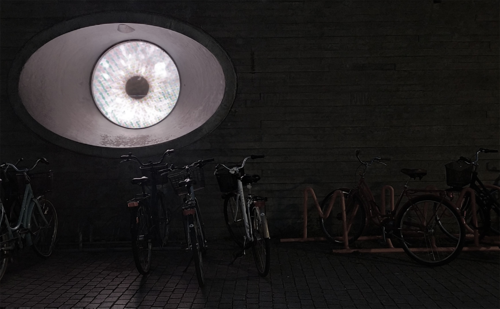
In Picture SKRC 4.1, the juxtaposition of sleek glass architecture and weathered stone walls creates a dynamic interplay between modernity and tradition. Conversely, Picture SKRC 4.2 lacks such contrasts, resulting in a less engaging and impactful composition.

Stronger Composition: Golden Triangles

Picture SKRC 6.1.1 Golden Triangles

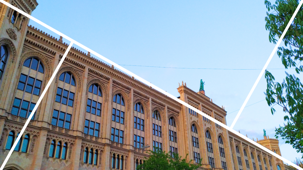
Think about cutting a sandwich diagonally into two triangles – it feels different than just cutting it straight across, right? That’s how the Golden Triangles Rule works in photography. It’s all about creating energy and balance by dividing your picture into triangles. Imagine drawing a diagonal line from one corner of your photo to the opposite corner, just like slicing that sandwich. Then, draw two more lines from the other corners that meet the diagonal at right angles. These lines create triangles in your photo, and the goal is to place important lines or shapes, like a sloping hill, a leaning tree, or the edge of a roof, along these diagonal lines. Key objects, like a person or animal, can stand out more when placed where the lines meet.

The Golden Triangles Rule is a photography technique that adds movement and flow to your pictures by encouraging you to align elements with diagonal lines. Unlike the calm and orderly nature of symmetry, this rule gives your photo a dynamic and adventurous feel.


Why It Works

Movement and Energy:

Triangles naturally make an image feel more dynamic. The combination of their sharp angles and directional energy creates visual tension, adding excitement and drama to your photo.

Cognitive Efficiency:

Triangles help structure your photo in a way that’s easy for the brain to process. The diagonal lines guide the viewer’s attention across the image, leading them to explore different areas rather than focusing on just one spot.

Aesthetic Pleasure:

Triangles bring a professional and artistic touch to photos. The intersecting lines of the Golden Triangles add depth and layers, making an image look visually appealing while maintaining a sense of balance.

Picture SKRC 6.2.1 Golden Triangles
Picture SKRC 6.2.2 Golden Triangles

Cultural and Artistic Influences

Triangular compositions have been used in art and photography for centuries to create striking and dynamic visuals. Examples from the fine arts can be Raphael’s “The Holy Family with a Lamb” and Caravaggio’s “The Supper at Emmaus“.

In modern photography, triangular divisions are often used to add a contemporary, dynamic touch to landscapes and portraits, creating drama and focus through careful alignment with the Golden Triangles grid.

In Pictures SKRC 6.1.2 you can see how a building’s slant angle fits neatly within the Golden Triangles, creating a balanced yet dynamic photo.

Stronger Composition: Pyramid

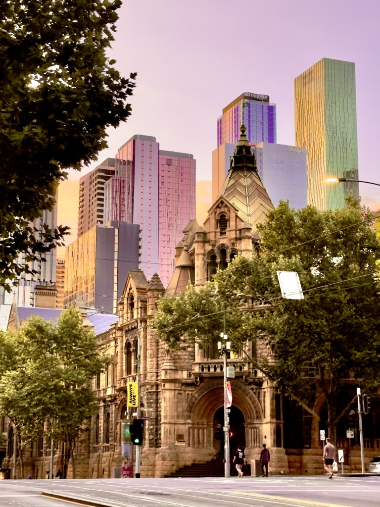
The concept of the Pyramid composition in photography, also known as Triangular composition or the rule of thirds applied diagonally,

The use of triangular or pyramid-like compositions can be traced back to classical art. Painters and artists often arranged elements in triangular formations to achieve balance and harmony in their works. Examples are Sandro Botticelli’s “The Birth of Venus” (c. 1484–1486), Raphael’s “The School of Athens” (1509–1511), Rembrandt van Rijn’s “The Anatomy Lesson of Dr. Nicolaes Tulp” (1632), Michelangelo Buonarroti’s sculpture “Pieta” (1498–1499).

Pyramid composition
Picture SKRC 5.1, Pyramid

The photos published on this page are a matter of copyright.
Photo credits to: Seg Kirakossian

Stronger Composition: Frame Within the Frame

The “Frame Within the Frame” is a compositional technique in photography where the photographer uses elements within the scene to create a frame around the main subject.

Before looking for framing elements, identify the main subject of your photograph. It could be a person, an object, or a scene that you want to highlight and draw attention to. Then look for elements within the environment that can naturally frame or surround your subject. This could include archways, doorways, windows, tree branches, or any other structural or natural elements that form a visual border around the subject. The frame acts as a visual guide, leading the viewer’s eyes towards the central subject.

The type of frame within the frame you choose can influence the mood of your photograph. For example, an arched doorway might add a touch of elegance, while tree branches might create a more natural and rustic feel.

Picture SKRC 4.1, Frame Within the Frame

The photos published on this page are a matter of copyright.
Photo credits to: Seg Kirakossian

Stronger Composition: Leading Lines

The principle of Leading Lines is a compositional technique in visual arts, including photography and painting, that involves using lines within an image to guide the viewer’s eyes towards a specific focal point or area of interest. Leading lines are essentially paths or visual elements that help direct attention, create a sense of movement, and enhance the overall visual impact of the composition.

leading lines composition
Picture SKRC 3.2.1, Leading Lines
leading lines
Picture SKRC 3.2.2, Leading Lines

The primary purpose of leading lines is to draw attention to the main subject or focal point of the image. Whether it’s a person, an object, or a specific area, the lines act as a visual pathway that directs the viewer’s eyes towards the intended center of interest. Leading lines can take various forms, including straight, diagonal, curved, or zigzag patterns. The choice of line type depends on the desired effect and the characteristics of the subject. Diagonal lines, for example, can convey a sense of energy and dynamism, while curved lines may suggest grace and flow. These lines can be literal, such as rivers, tree branches, roads, pathways, or railings, or implied through the arrangement of shapes, shadows, or other elements.

Picture SKRC 3.1.1, Leading Lines

By incorporating leading lines that converge towards a vanishing point, the photographer can simulate perspective, making the composition feel more immersive and three-dimensional.

While the term “leading lines” might not have been explicitly used in classical art, many artists employed compositional techniques that guide the viewer’s eyes towards a focal point or subject within the artwork. Among examples are Leonardo da Vinci’s “The Last Supper” (1495–1498), Caravaggio’s “The Supper at Emmaus” (1601), Vincent van Gogh’s “Starry Night” (1889).

The photos published on this page are a matter of copyright.
Photo credits to: Seg Kirakossian

  • 7
  • 7.1

Stronger Composition: Golden Ratio

0, 1, 1, 2, 3, 5, 8, 13… This is called Fibonacci sequence – a series of numbers where each number is the sum of two previous ones. The ratio between consecutive Fibonacci numbers corresponds with the Golden Ratio. The concepts have been known since ancient Greece where it was explored by mathematicians, such as Euclid.

The Golden Ratio, often represented by the Greek letter phi (Φ), equals 1.618. This ratio has been found in various aspects of art, nature, and architecture. It looks like a spiral that involves dividing an image into squares.

Golden Ratio example on a photo
Picture SKRC 7.1, Golden Ratio

The choice between the golden ratio, the Rule of thirds or Symmetry in photography often depends on the specific goals of the photographer and the characteristics of the subject/landscape. Each composition can be effective in different contexts. Here are situations where the golden ratio might be preferable:

  • Spiraling Compositions (curves or spirals);
  • Subtle Emphasis on Key Areas (no domination by the main subjects);
  • Artistic or Abstract Photography.

The form of a spiral that is based on the rule of the Golden Ratio can be compared to natural phenomena too, for example, Sea Shells, Sunflowers and Flower Petals, Pinecones and Pineapples, Hurricanes and Galaxies, fingerprints etc.

The video below visualises all the philosophy laying under the Golden Ratio.

Here is a brief overview of the evolution of the Golden Ratio:

Historical Use: Artists and architects in ancient Greece, such as Phidias and the builders of the Parthenon, were likely aware of the aesthetic qualities of the golden ratio, even if they didn’t explicitly name it. Elements of the golden ratio can be seen in their works.

Renaissance Artists: During the Renaissance, artists like Leonardo da Vinci and Michelangelo showed an interest in the golden ratio and incorporated its principles into their compositions. Da Vinci’s “Vitruvian Man” is often cited as an example of the golden ratio in art.

Mathematical Treatises: In the 19th and early 20th centuries, mathematical treatises explored the properties of the golden ratio, and its relationship with aesthetics gained attention in academic circles.

Photography: When photography became an established art form, photographers and educators began to apply compositional principles inspired by the golden ratio. The idea was to use the ratio to guide the placement of key elements within the frame for a more balanced and visually pleasing result.

The photos published on this page are a matter of copyright.
Photo credits to: Seg Kirakossian

Stronger Composition: Symmetry

Think about a butterfly’s wings – they’re the same on both sides, right? That’s symmetry in nature. Now lets imagine you’re taking a picture of your favorite toy or a beautiful flower, and you want it to look extra special. Try placing things so they match on both sides of your invisible line.

If you draw an invisible line right in the middle of your picture (vertical or horizontal), everything on one side should be like a twin or a reflection of everything on the other side. It’s like creating a perfect world of doubles. Symmetry makes your photo feel calm and balanced.

The rule of symmetry in photography is a compositional guideline that involves creating balance and harmony in an image by aligning elements along a central axis. Symmetry can be found in various forms, such as reflective symmetry (mirror image) or radial symmetry (circular balance).

Picture SKRC 2.1, Rule of Symmetry

This rule is directly connected with human biology. Particularly, our brain has a natural affinity for symmetry, and this preference is believed to be rooted in both evolutionary and cognitive factors.

Evolutionary Advantage:
Evolutionary psychologists propose that the preference for symmetry may have evolved because symmetrical features are often associated with good health and genetic fitness. In the animal kingdom, asymmetry can be a sign of developmental issues or genetic abnormalities. Therefore, individuals with more symmetrical features may be perceived as healthier and more likely to pass on robust genes to their offspring. Over time, this preference for symmetry may have become ingrained in human psychology.

Cognitive Efficiency:
Symmetrical patterns are often simpler and more regular than asymmetrical ones. The human brain tends to process and recognize familiar, regular patterns more quickly and efficiently. Symmetry provides a sense of order and predictability, making it easier for the brain to process visual information. This cognitive efficiency may contribute to the aesthetic appeal of symmetrical designs.

Aesthetic Pleasure:
The brain also experiences a sense of pleasure and aesthetic satisfaction when encountering symmetrical patterns. This response is evident in various forms of art, architecture, and design. Symmetry can create a feeling of balance and harmony, which is pleasing to the human eye and contributes to a positive emotional response.

Neurological Processing:
Studies (1, 2) using brain imaging techniques such as fMRI (functional magnetic resonance imaging) have shown that the brain responds differently to symmetrical and asymmetrical stimuli. Symmetrical patterns may activate certain areas of the brain associated with reward and positive emotions.

Cultural and Environmental Influences:
While there may be some universal aspects to the preference for symmetry, cultural and environmental factors also play a role. Different cultures may have varying preferences for symmetry based on artistic traditions, historical influences, and aesthetic norms (for example, African Textile Designs, Ancient Chinese Calligraphy and Art, Baroque Architecture in Europe, Mesoamerican Art and Murals, Armenian Carpet Patterns etc).

In the picture SKRC 2.1 you can see an example of symmetrical composition. Meanwhile the SKRC 2.2 is an example of how the composition can’t be considered a symmetry as the background, particularly the building, appears differently on the right and left sides of the central axis.

Picture SKRC 2.2, Rule of Symmetry (Correct)Picture SKRC 2.3, Rule of Symmetry (Incorrect)

The photos published on this page are a matter of copyright.
Photo credits to: Seg Kirakossian

  • rule-of-thirds 1.2
  • Grides
  • 1.0-grids
  • 1.5
  • 1
  • 1.4.1
  • 1.4.1-1
  • 1

Stronger Composition: Rule of Thirds

Avez-vous entendu parler de la règle des tiers?

Imaginez que vous fassiez un dessin ou que vous preniez une photo de quelque chose ! La règle des tiers est une astuce secrète qui peut rendre votre image encore plus attrayante et agréable. Selon cette règle, au lieu de tout placer au milieu, imagine que ton dessin est divisé en neuf carrés, comme une grande tablette de chocolat. Deux lignes montent et descendent et deux lignes traversent. Ces lignes créent neuf parties égales, comme les morceaux de votre chocolat préféré !

Picture SKRC 1.0, Rule of Thirds

La philosophie de cette règle est la même que celle qui consiste à préparer une délicieuse pizza en répartissant uniformément toutes les garnitures. En d’autres termes, vous devez essayer de placer les parties/objets les plus importants de votre photo là où les lignes se croisent ou le long des lignes, comme si vous cachiez un trésor dans un endroit spécial.

rule of thirds with grids
Picture SKRC 1.2.2, Rule of Thirds

Vous ne savez toujours pas de quoi il s’agit? Continuez!

La règle des tiers est une ligne directrice de composition utilisée dans les arts visuels, y compris la photographie/vidéographie, la peinture et le design.

L’origine de la règle des tiers n’est pas attribuée à des personnes ou à des auteurs spécifiques, car elle a évolué au fil du temps et constitue un principe largement accepté dans les arts visuels. Elle remonte toutefois à l’art grec ancien et au concept du nombre d’or, qui consiste à diviser une composition en proportions esthétiquement agréables (par exemple : le nombre d’or, dont nous parlerons plus tard sur mon site web).

Picture SKRC 1.4, Rule of Thirds
Picture SKRC 1.4.1, Rule of Thirds

L’expression “règle des tiers” a gagné en popularité aux XVIIIe et XIXe siècles, en particulier dans le domaine de la peinture. Les artistes et les théoriciens ont prêté attention aux compositions asymétriques afin de créer des œuvres d’art plus dynamiques et visuellement attrayantes. Bien que le concept n’ait pas été nommé exactement “règle des tiers” à l’époque, le principe consistait à diviser la toile en tiers.

Dans le cas de la photographie, la règle des tiers s’est répandue au 20e siècle avec l’apparition des directives de composition photographique. Les photographes et les éducateurs ont commencé à utiliser le terme et à promouvoir la règle comme un outil utile pour créer des images dynamiques.

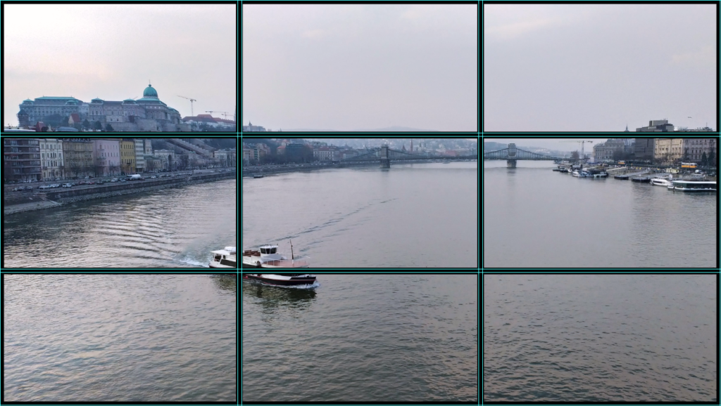
Par exemple, dans l’image SKRC 1.2.2, le navire est positionné dans le point de croisement supérieur droit de la grille de la règle des tiers. La ligne d’horizon, qui sépare le ciel de la mer, s’aligne sur la ligne horizontale supérieure de la grille. En outre, la ligne entre le rivage et l’eau correspond à la ligne horizontale inférieure de la grille. En respectant la règle des tiers, la photo présente une composition agréable à l’œil, qui guide le regard de l’observateur sur l’image tout en mettant en valeur des éléments clés tels que le navire et la ligne d’horizon.

Picture SKRC 1.5, Rule of Thirds

Voici comment vérifier si l’appareil photo de votre smartphone respecte la règle des tiers :

Paramètres de l’appareil photo :

  • Ouvrez l’application de l’appareil photo.
  • Cherchez l’icône des paramètres/options.
  • Naviguez jusqu’à l’option “Grille” ou “Lignes de la grille”.

Activez les lignes de la grille et l’écran de votre appareil photo sera désormais doté de la grille de la règle des tiers (il peut également y avoir d’autres options de lignes de la grille).

Il s’agit d’un outil précieux pour les photographes amateurs et expérimentés utilisant des appareils mobiles.

Les photos publiées sur cette page relèvent du droit d’auteur.
Crédits photos à : Seg Kirakossian